Landing page & widgets
The landing page is the first thing people see in your library. From Manage Library → Landing Page you control its header and branding, the widgets on it, and the sidebar that frames the whole app. For the step-by-step, see Customize the landing page.
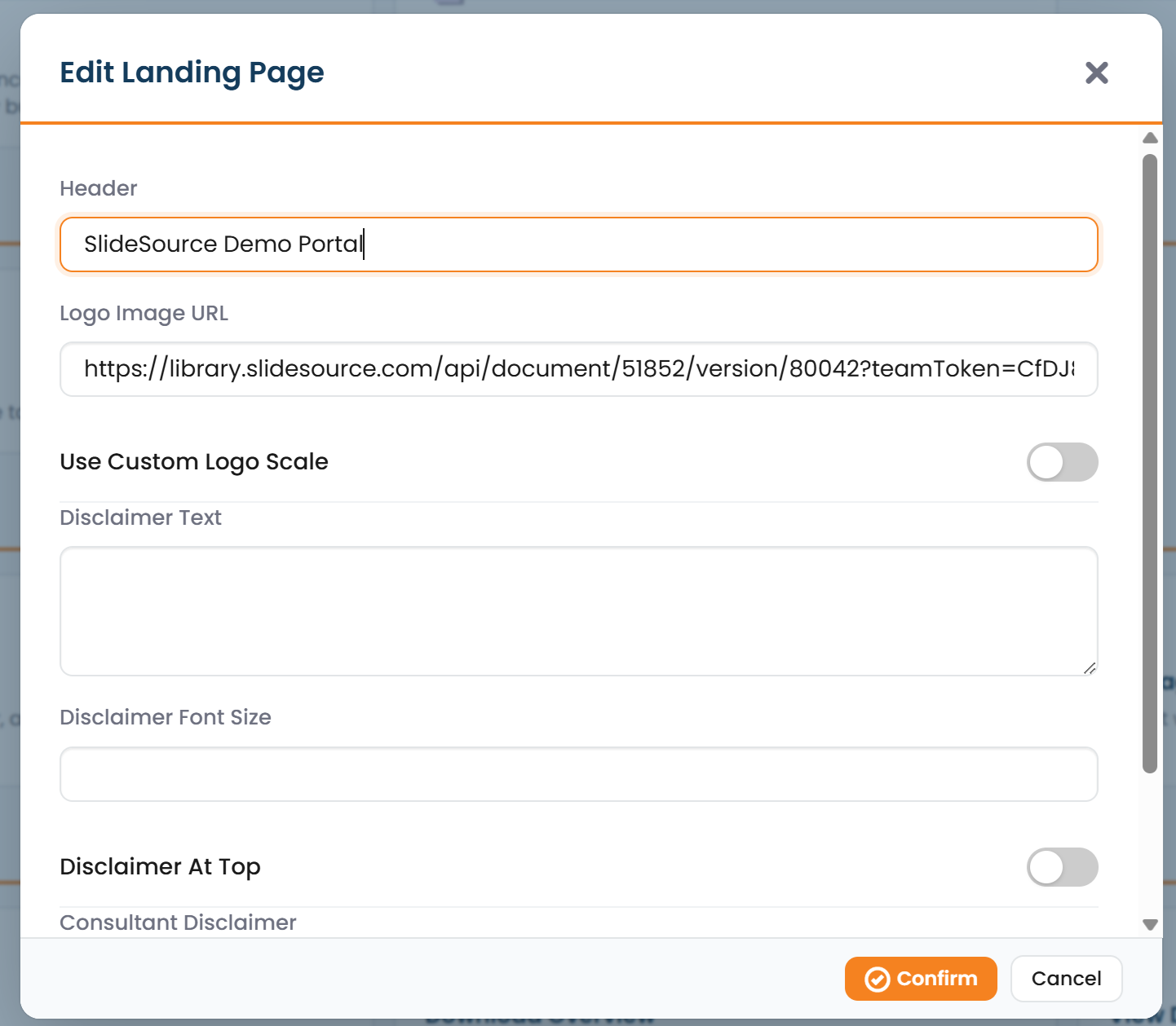
Landing Page settings
Section titled “Landing Page settings”Edit Landing Page controls the page’s header and the notices shown on it:
- Header: the title/heading area at the top of the page.
- Logo: your organization’s logo.
- Disclaimer: the standard disclaimer text shown to people in your library.
- Consultant disclaimer: a separate disclaimer shown in the auto-derived consultant view (the single-collection view outside collaborators see). See External / consultant access.
Use Preview to open the page exactly as visitors see it before you publish changes.
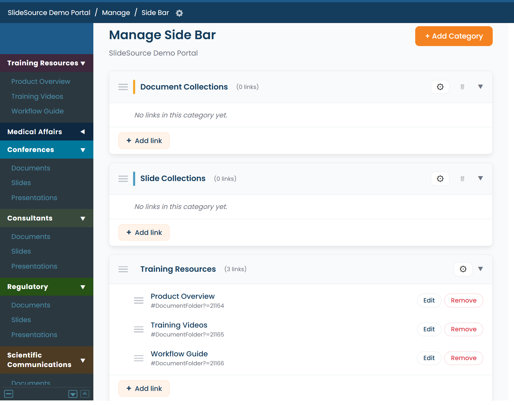
Manage Side Bar
Section titled “Manage Side Bar”Manage Side Bar controls the collections and links listed in the sidebar: the navigation rail down the edge of the app. You decide which collections appear, how they’re grouped and ordered, and which links to include, so people land on the content that matters most.
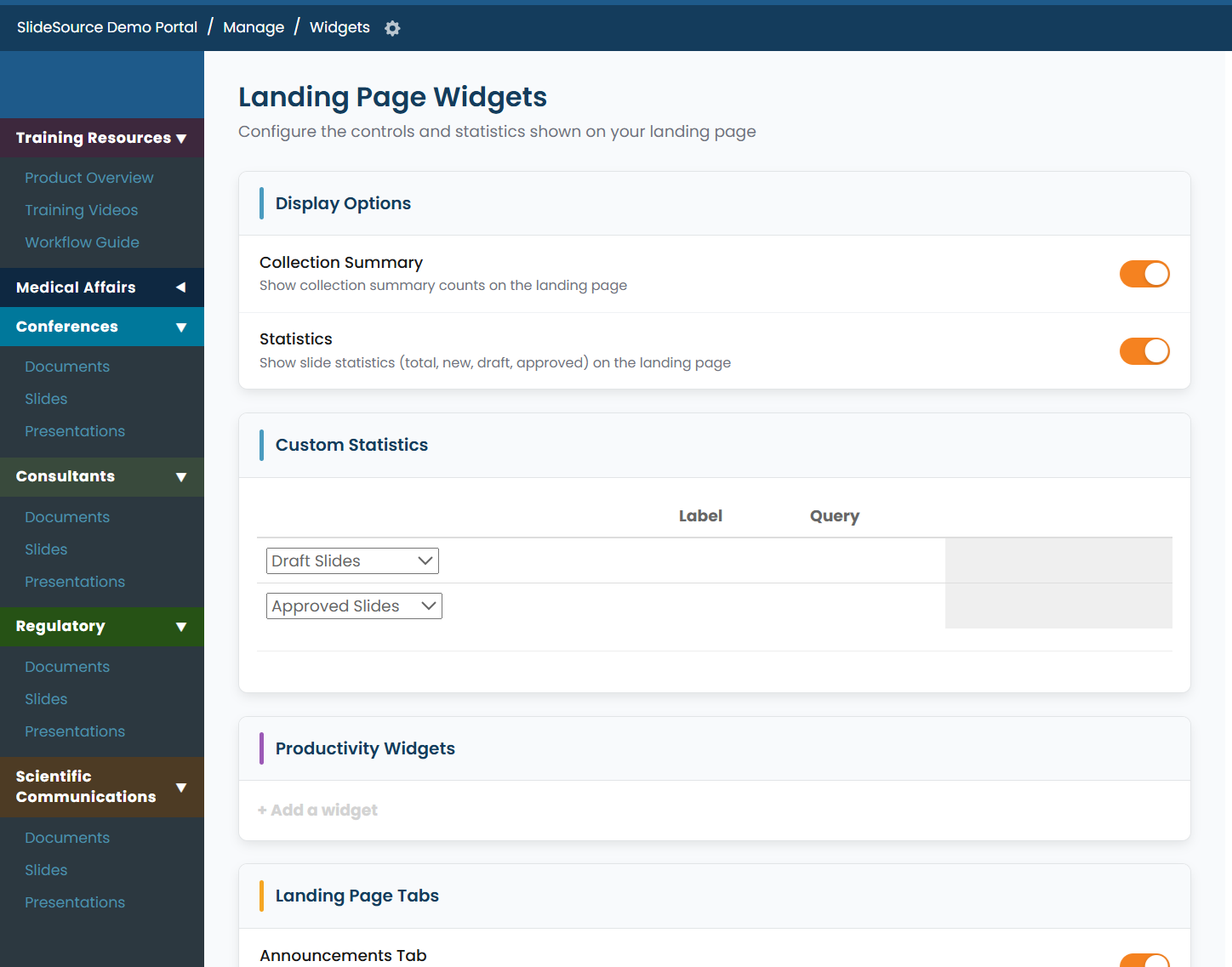
Manage Widgets
Section titled “Manage Widgets”Manage Widgets controls the widgets shown on the landing page: the tiles and panels that surface collections, activity, statistics, and shortcuts. Add, remove, and arrange widgets to build a useful home screen for your library.
Shared Presentation Listing
Section titled “Shared Presentation Listing”The Shared Presentation Listing is a public listing of selected presentations that can be embedded outside the library. You configure what it shows here; the embedding and integration details are covered in Integrations.